Create Your Perfect Social Media Cover, Header or Banner Using Safe Zones Areas
by Zara Bogaski, Creative Social Visuals
Updated: January, 26, 2022
Be Aware of Responsive Design
We all know images are important to attract our audience on social media. And when starting out, designing a banner for social media can be a little more involved than expected because of the responsive design that adjusts the particular display that you are using. It can be frustrating to discover that the design you carefully selected may be cropped or stretched for mobile, tablet or desktop view. It is always a moving target were labels that are too close to the edge may be cropped or your profile image is superimposed on elements you intended to display.
To make things worse, there is a lot of outdated, undated, or incomplete information out there that has not kept up with the ever shifting changes social media platforms. Even on their own websites the information may be outdated because they may make small tweaks or make an overhaul at any time.
In some cases, you may opt to keep your banner as simple as possible, avoid the edges, and stay within the safe zones for the most important elements of your design. Your aim is to have a design that no matter the display, it will still show your brand.
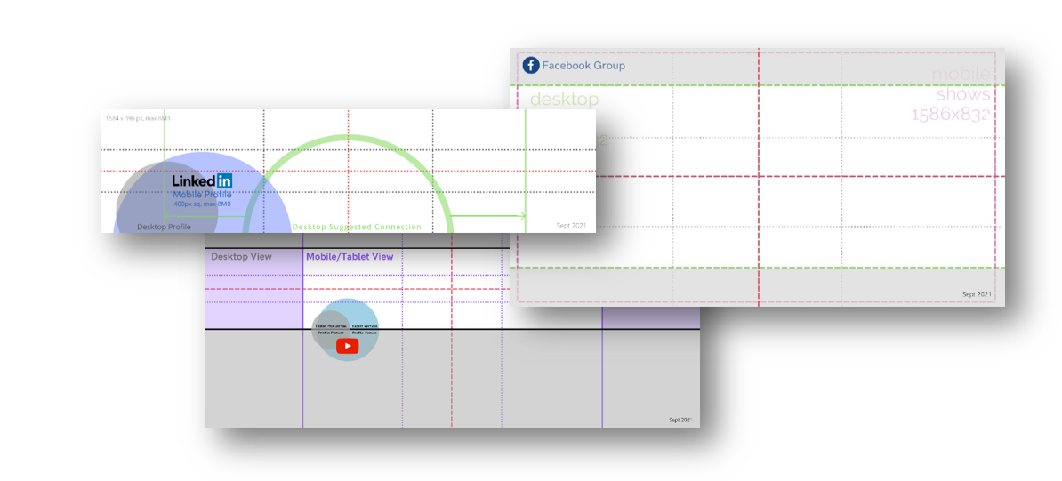
Mobile First Gridlines with a Caveat
At a certain point you have to decide which display has priority in your design according to the display that most of your target audience uses. Generally speaking, mobile (smartphone) is most likely the one to be used for social media viewing. Tablets have a high usage for entertainment purposes. Smartphones are used more for shorter content than tablets. If you are approaching a general audience mobile first design is encouraged, tablet second, and desktop/laptop third. You design for all, but you give preference in that order.
Design Gridlines
The one thing I didn’t find in my search for templates was the use of guiding gridlines. Gridlines using the rule of thirds or middle cross intersection lines as used in photography. These gridlines are visually very helpful with placement of objects within your design. Also, keep in mind that banners will appear small on mobile.
The templates offered only include platforms that I personally use for business purposes. However, if you find you need to make your own templates, you can reverse engineer your own templates using Canva and the instructions included in the download.
My hope is that I can offer you the shortcuts and awarness so you can make your own perfect design to attract your audience.
.png)